ADCB x Shukran Co-Branded Credit Card

ADCB x Shukran Co-Branded Credit Card

2024-2025

2024-2025

1.6M AED

1.6M AED

Revenue Impact through a landing page and touchpoints

Revenue Impact through a landing page and touchpoints

[Design process]

[Design process]

[Background]

[Background]

Landmark Group has partnered with ADCB (Abu Dhabi Commercial Bank) to create co-branded credit card called Shukran ADCB Credit Card. This card allows customers to earn and redeem points across different brands inside of Landmark outlets and outside as well.

Landmark Group has partnered with ADCB (Abu Dhabi Commercial Bank) to create co-branded credit card called Shukran ADCB Credit Card. This card allows customers to earn and redeem points across different brands inside of Landmark outlets and outside as well.

[competitive alanysis]

[competitive alanysis]

Share Rewards

Share Rewards

talabat

talabat

Noon

Noon

blue rewards

blue rewards

Competitors communicated card benefits but none of them tried to sell the card.

Competitors communicated card benefits but none of them tried to sell the card.

(I saw this as an advantage we could own)

I conducted a competitive analysis expecting to find best practices I could build on, but what I found instead was

I conducted a competitive analysis expecting to find best practices I could build on, but what I found instead was

they all fell short in emotional side

they all fell short in emotional side

[User flow]

[User flow]

I've mapped the journey across the critical touchpoints and a landing page as it was important to understand and know where would it be right to place a banner, what banner should be on basket and checkout having in mind that a user will be in a purchasing mode and it might hurt conversion.

I've mapped the journey across the critical touchpoints and a landing page as it was important to understand and know where would it be right to place a banner, what banner should be on basket and checkout having in mind that a user will be in a purchasing mode and it might hurt conversion.

I've mapped the journey across the critical touchpoints and a landing page as it was important to understand and know where would it be right to place a banner, what banner should be on basket and checkout having in mind that a user will be in a purchasing mode and it might hurt conversion.

[Wireframes]

[Wireframes]

Part of the process where the structure of the content and hierarchy was established and aligned with the stakeholders.


[UI Design]

Desktop screens

Desktop screens

Hero Section

For the hero section, I wanted to lead with a strong headline and a clear CTA, paired with a 3D render of the card itself. The goal was to make the value land within the first second of the user arriving on the page, while the 3D imagery reinforced the premium feel.

Benefits

This was a crucial part of the page where my primary goal was to highlight every benefit the card brings, with the 10% value back as the key anchor, surrounded by the other perks users would get on top of it.

How it works

Here I wanted to communicate the steps clearly and show how effortless it is to apply, receive the card, and start using the benefits. Also presented rails with brands where customers can enjoy the benefits.

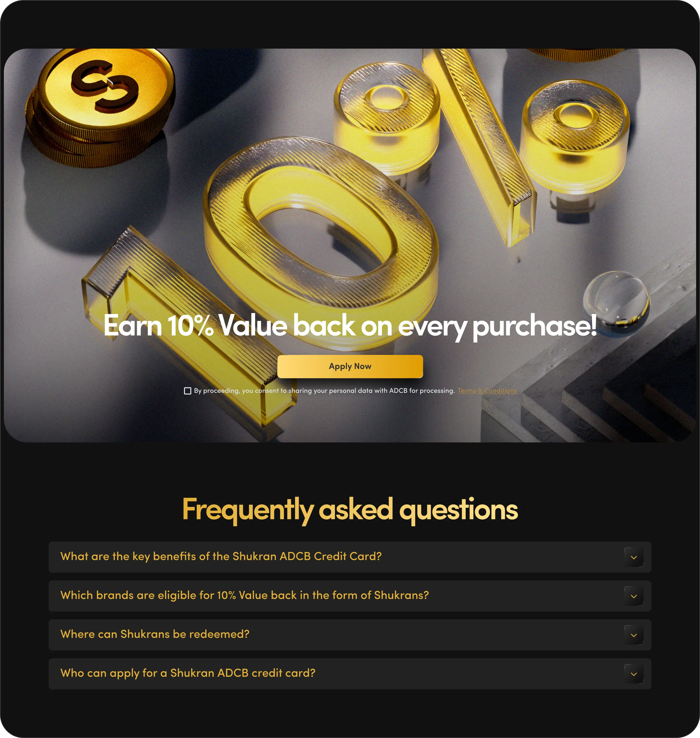
Banner & FAQ

A reiteration of the 10% value back, followed by an FAQ section to give users clarity on the most common questions.

Mobile screens

Mobile screens

Touchpoints

Touchpoints

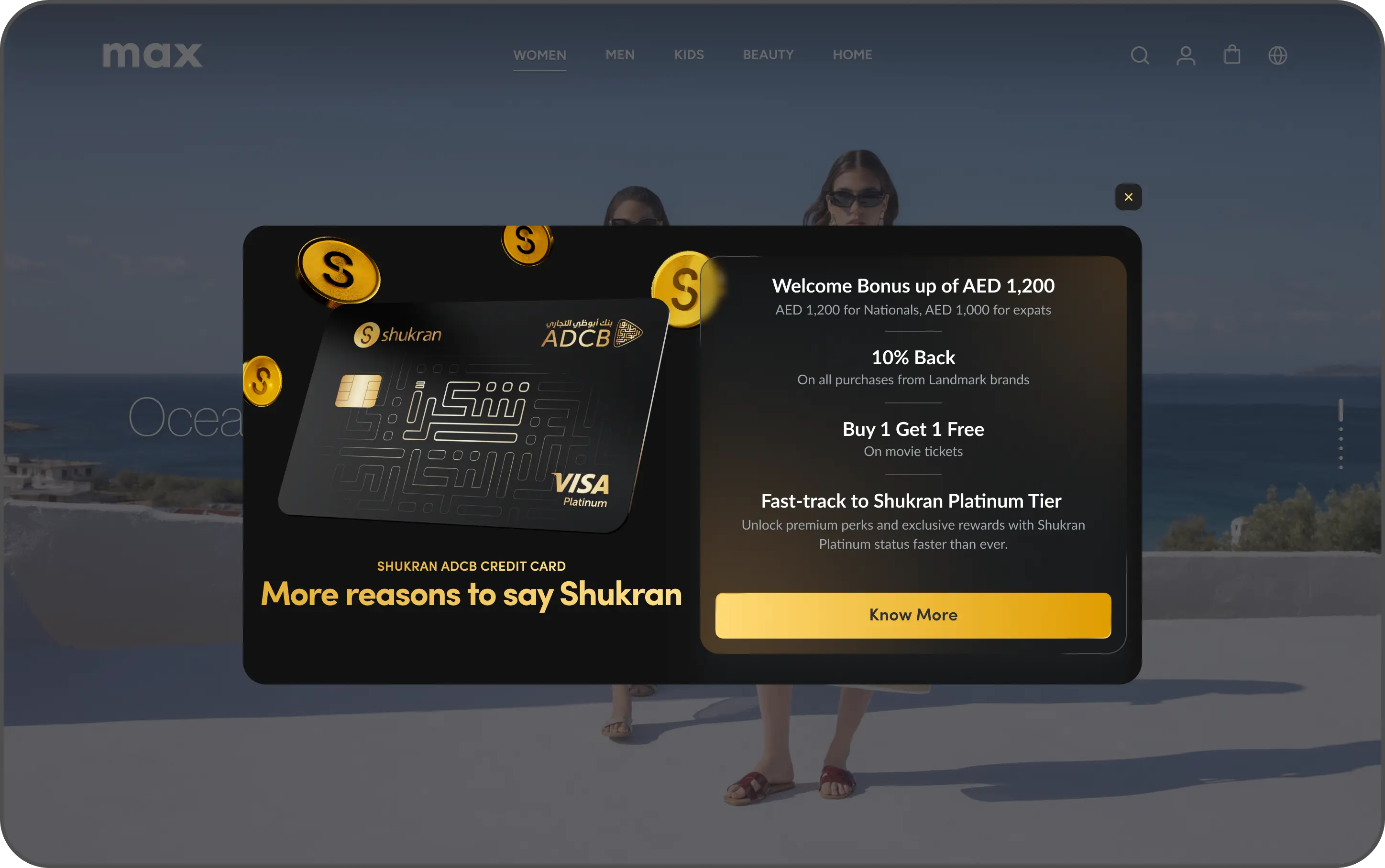
Homepage

The homepage is the entry point of the journey, so a pop-up was essential to create immediate awareness of the credit card launch. This is the moment the user is most open to new information, before they shift into a task-focused mindset.

Product description page

On the PDP, the user is in exploratory mode, still browsing, still open to discovery. A banner with a clear CTA fit naturally here, nudging the user to learn more about the card without pulling them away from what they were already doing.

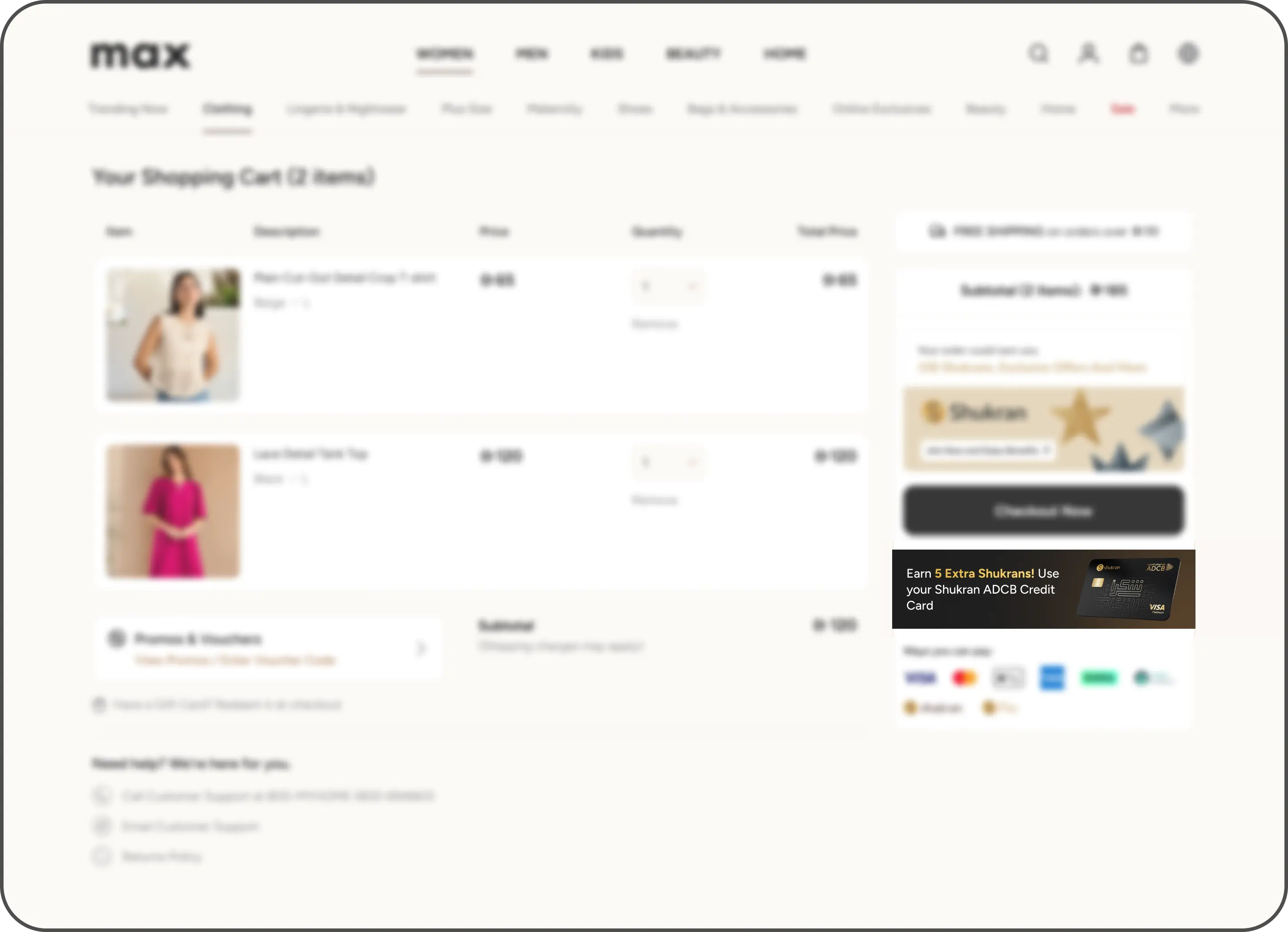
Basket & Checkout

On the basket and checkout pages, the user is in purchase mode and any disruption could hurt conversion. I made a deliberate decision to keep the messaging visible but non-clickable, awareness without interference, protecting the most critical part of the journey.

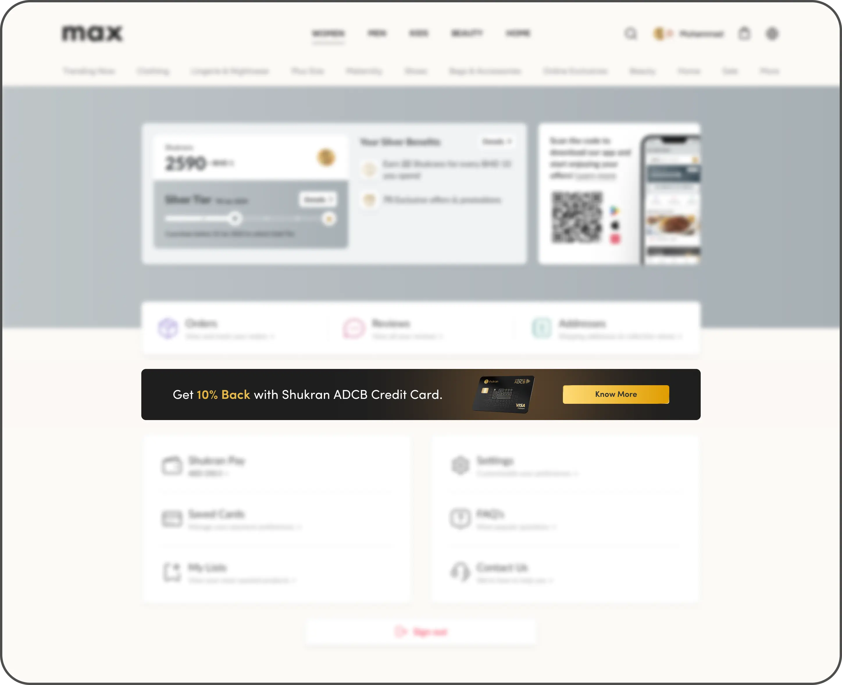
My account & Thank you page

My account and the thank you page were the right moments to bring the CTA back. On the thank you page especially, the user has completed their transaction and is in a post-purchase mindset relaxed, satisfied, and open to what's next. That made it the strongest secondary opportunity to convert.
[impact]

[impact]

1.6M

1.6M

In revenue

In revenue

Generated across the landing page and touchpoints within 6 months of launch, validating that design decisions rooted in user psychology and market gaps can move commercial outcomes.

Generated across the landing page and touchpoints within 6 months of launch, validating that design decisions rooted in user psychology and market gaps can move commercial outcomes.

10k

10k

Applications

Applications

Card applications submitted through the digital channels I designed, contributing directly to Landmark's partnership revenue

Card applications submitted through the digital channels I designed, contributing directly to Landmark's partnership revenue

1.5% CTR

1.5% CTR

Homepage

Homepage

The homepage outperformed every other surface in click-through rate

The homepage outperformed every other surface in click-through rate

Create a free website with Framer, the website builder loved by startups, designers and agencies.